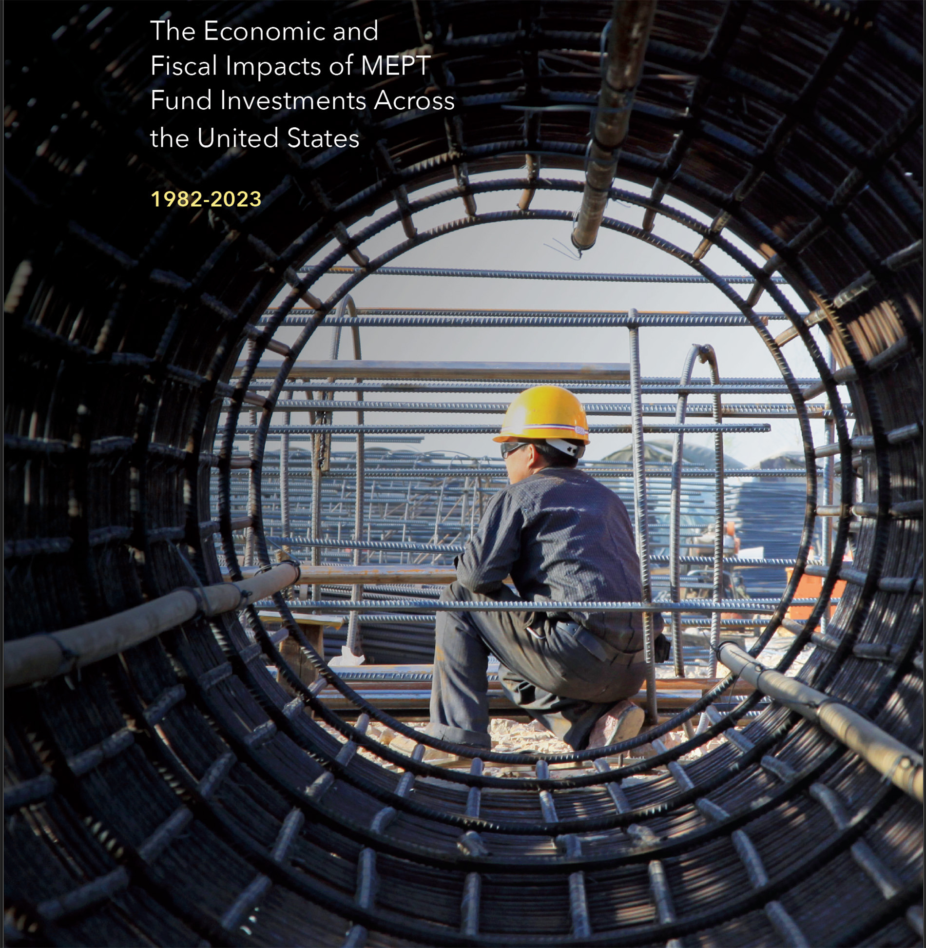

Overview
Led the development of a scalable investor communications design system to support presentations, reports, and executive materials for institutional audiences. The system translated complex financial data into clear, structured, and brand-aligned visual communication across multiple touchpoints.
Role
Senior Graphic Designer/Information Design Lead
Partnered with investor relations, finance, and portfolio management,
and executive teams to shape how financial performance and strategy were communicated visually.
Scope
Visual strategy for investor communications
Presentation framework and slide system
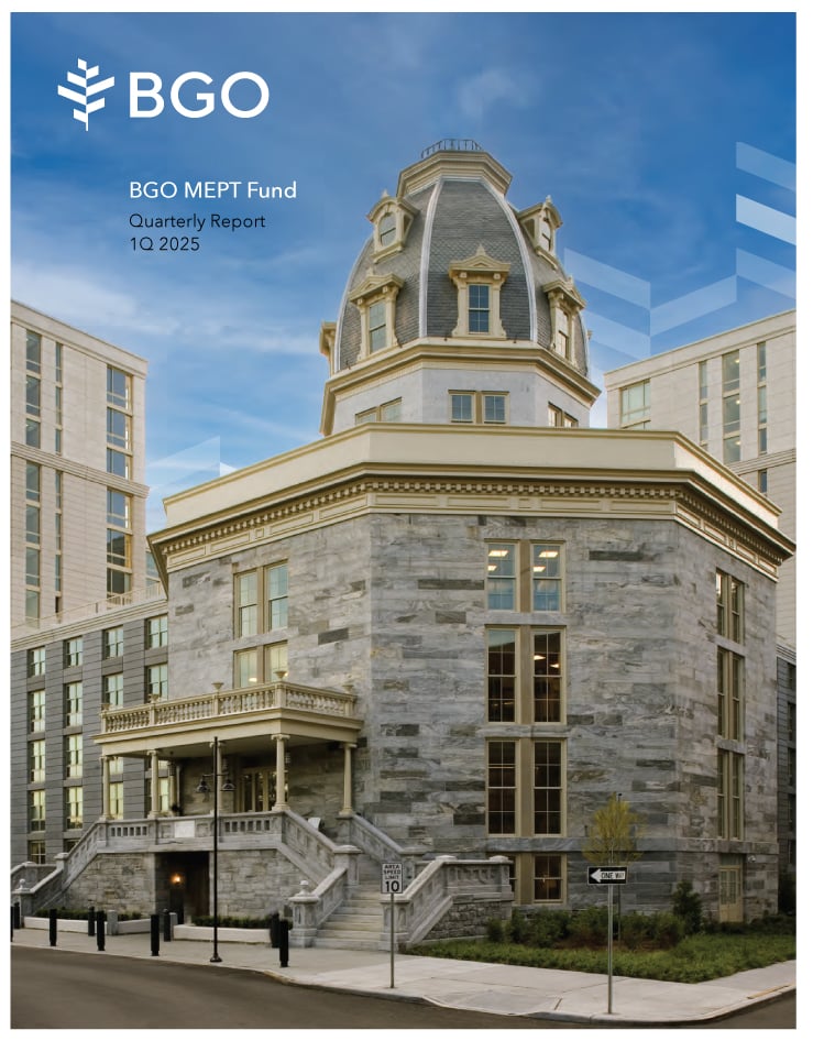
Annual and quarterly report design
Data visualization standards and templates
Typography and layout hierarchy for complex information
Challenge
Financial information was complex and inconsistent across communications. Different teams used varied formats, leading to fragmented communication and reduced clarity for high-stakes audiences. At the same time:
Financial data was complex and required precision
Messaging needed to be quickly understood by institutional investors
Presentations and reports lacked a unified structure
Teams needed to produce materials under tight deadlines
Investor Communications Design System
Turning Complex Strategy into Clear Visual Communication
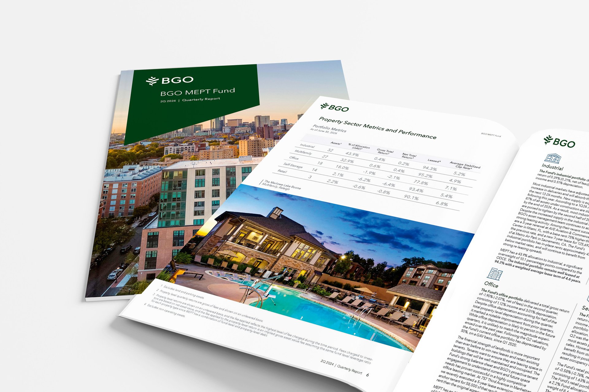
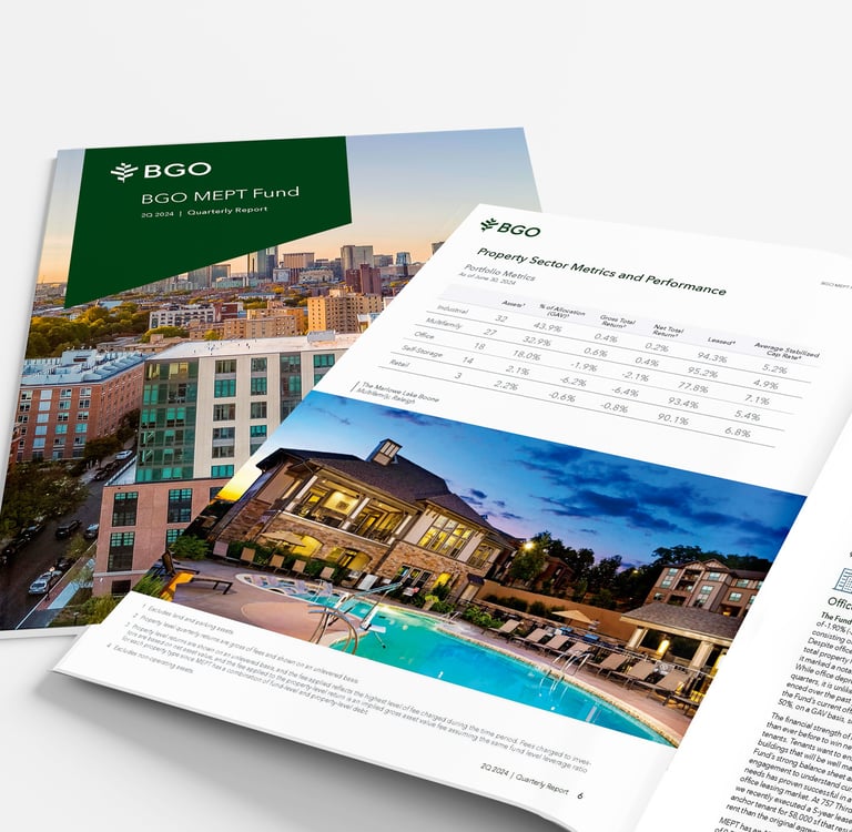
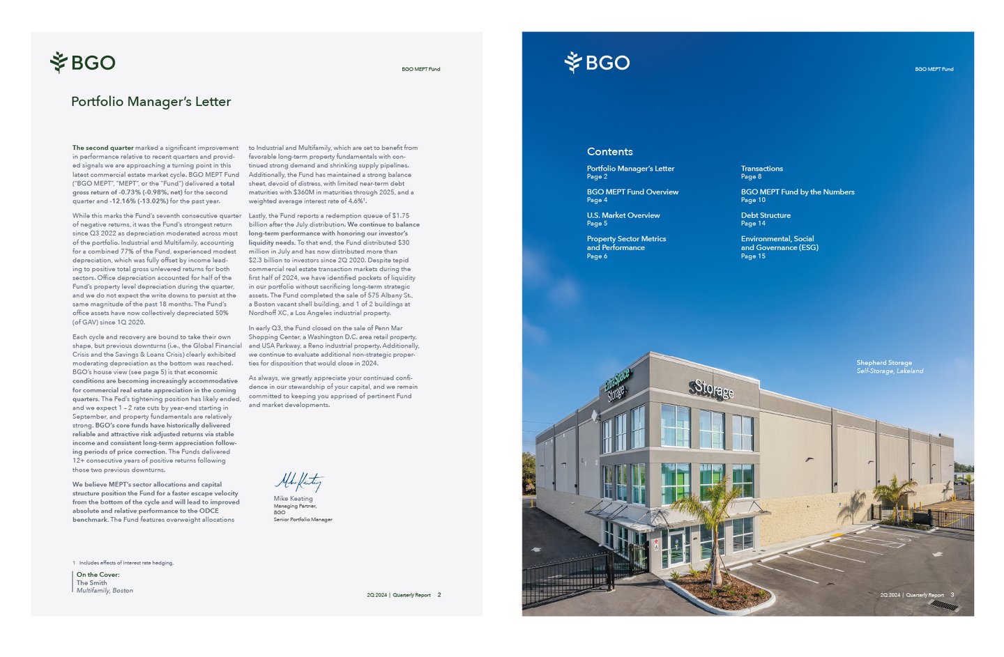
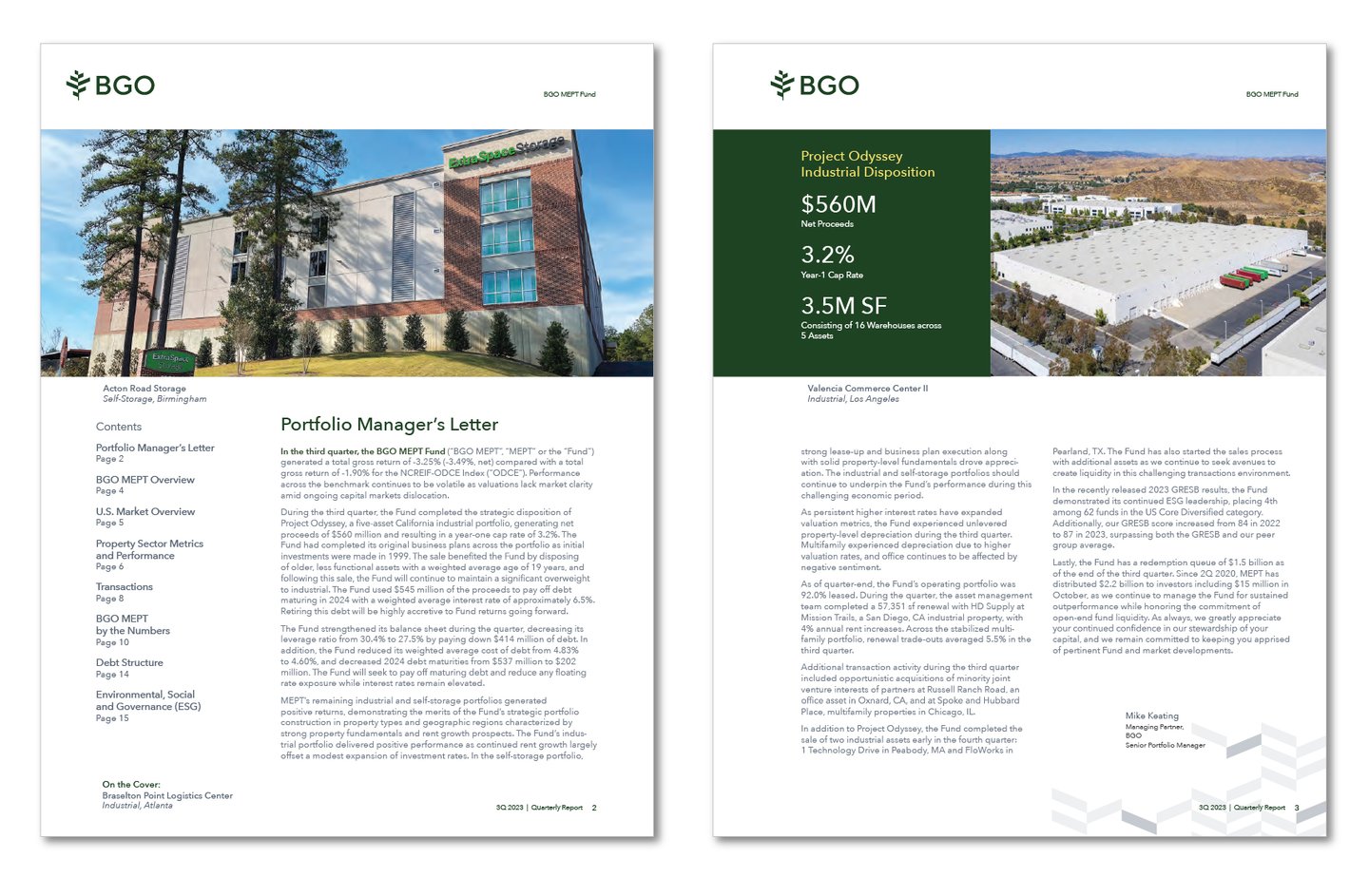
Selected pages
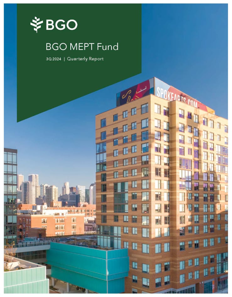
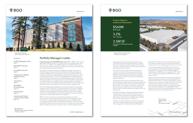
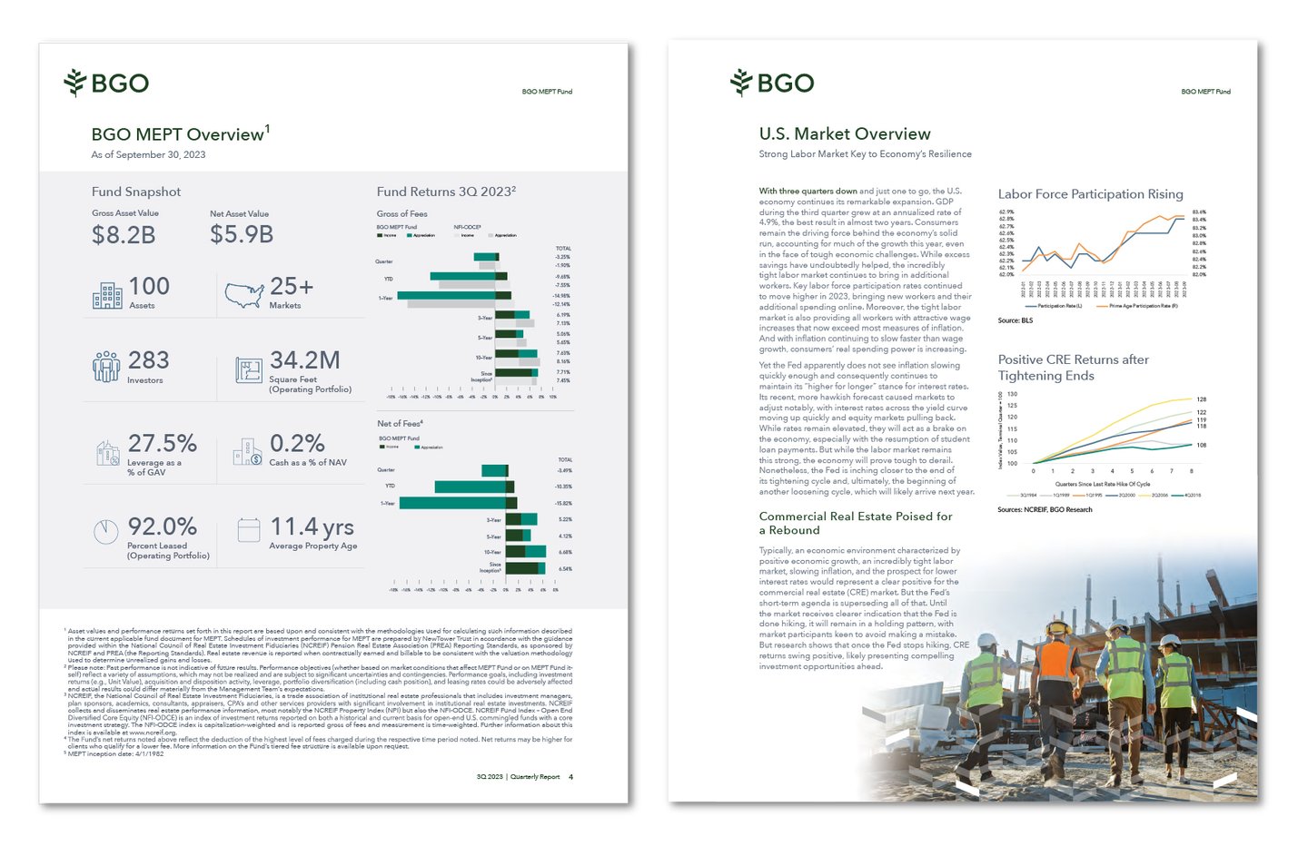
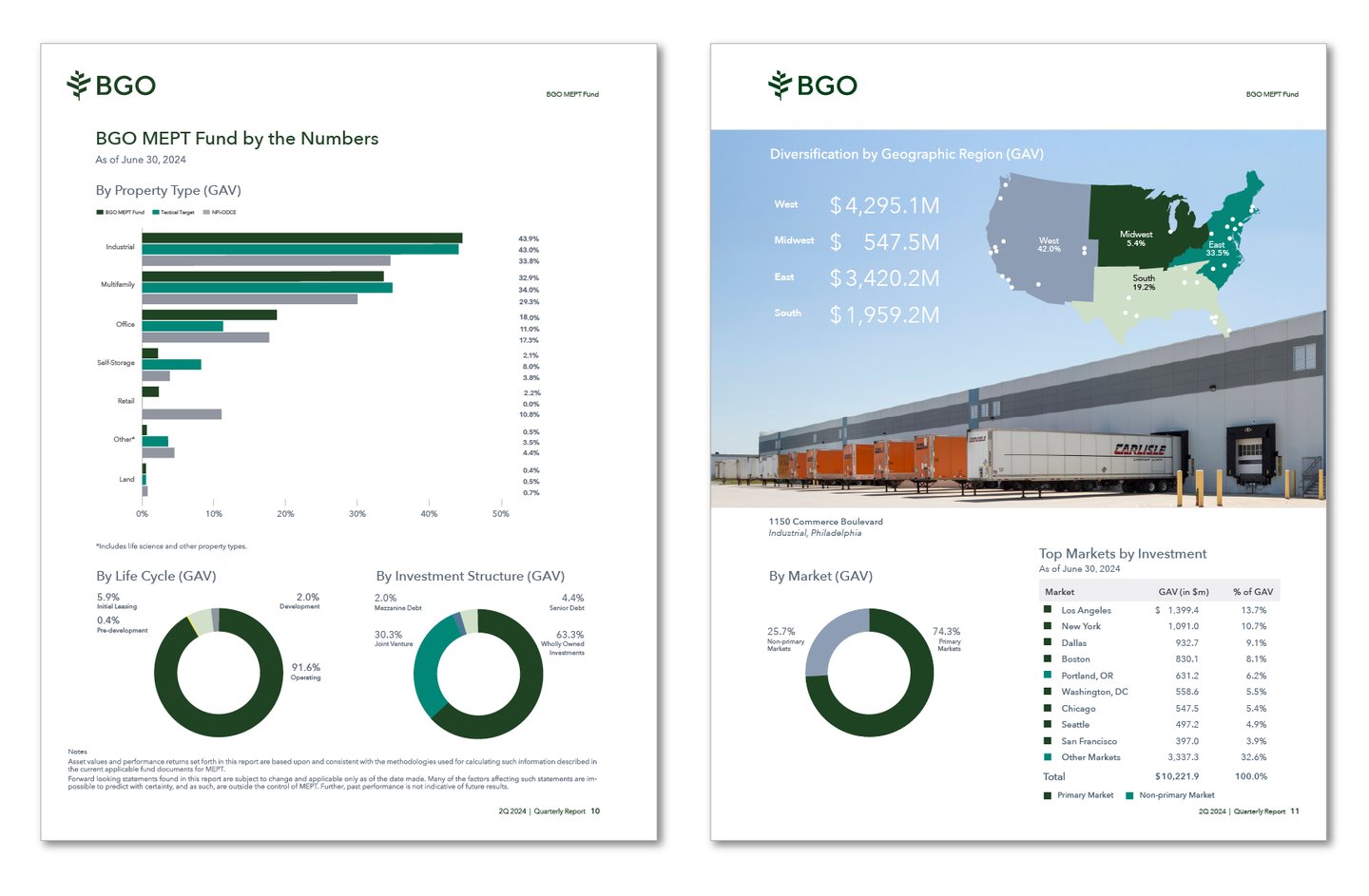
Quartertly Reports
Selected covers of various quarterly reports


Approach
I reframed the problem as an information design and systems challenge, focusing on clarity, consistency, and usability.
1. Define Communication Principles
Established a foundation for how information should be presented:
Prioritize clarity over density
Structure content for quick scanning and comprehension
Use visual hierarchy to guide decision-making
2. Build a Modular Presentation System
Developed a flexible slide framework that could scale across different use cases:
Standardized layouts for key content types (performance, strategy, data)
Grid-based system to ensure consistency and alignment
Reusable slide templates to streamline content creation
3. Create Data Visualization Standards
Simplified complex financial information through structured visuals:
Designed consistent chart styles and formatting rules
Established hierarchy for highlighting key metrics and insights
Reduced cognitive load through clean, minimal visual design
4. Establish Typography & Layout Hierarchy
Improved readability across all materials:
Defined clear typographic scale for headlines, data, and supporting content
Introduced spacing systems to improve flow and legibility
Aligned all materials with the broader brand system
5. Enable Cross-Team Adoption
Ensured the system could be used effectively across teams:
Delivered templates and guidelines for internal stakeholders
Streamlined workflows for faster production
Partnered with teams to maintain consistency and quality
Visual Execution
The system created a cohesive language across investor materials:
Structured, easy-to-navigate presentation decks
Clean, consistent data visualizations
Reports with clear hierarchy and improved readability
Unified visual identity across all communications

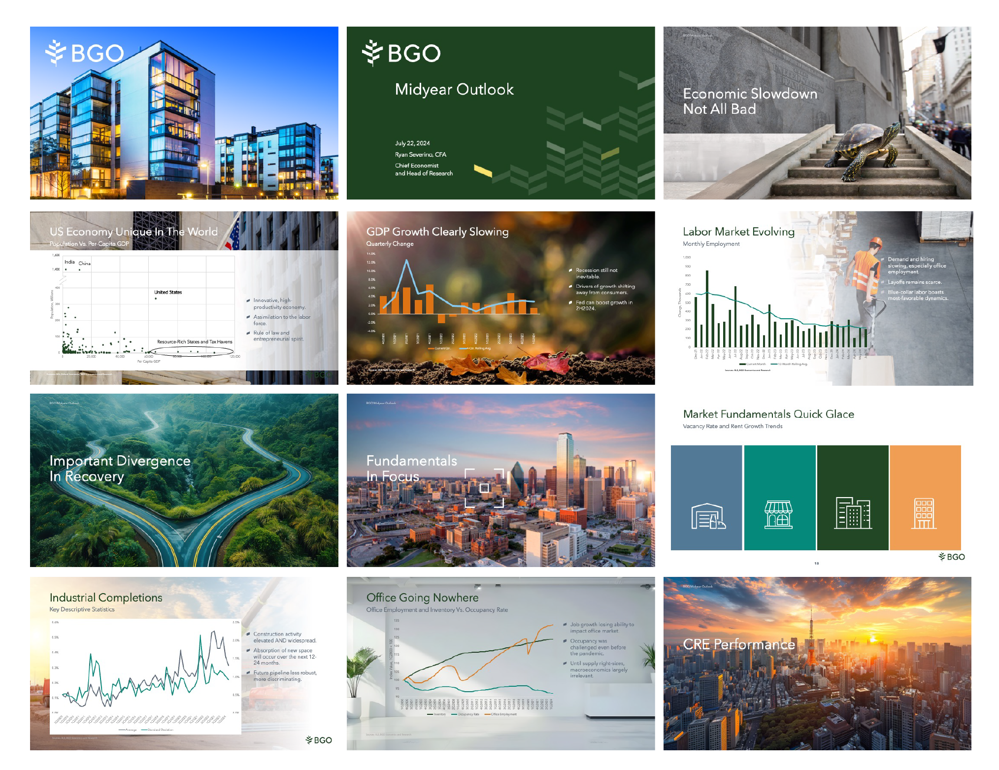
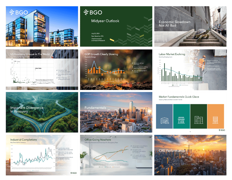
Presentations
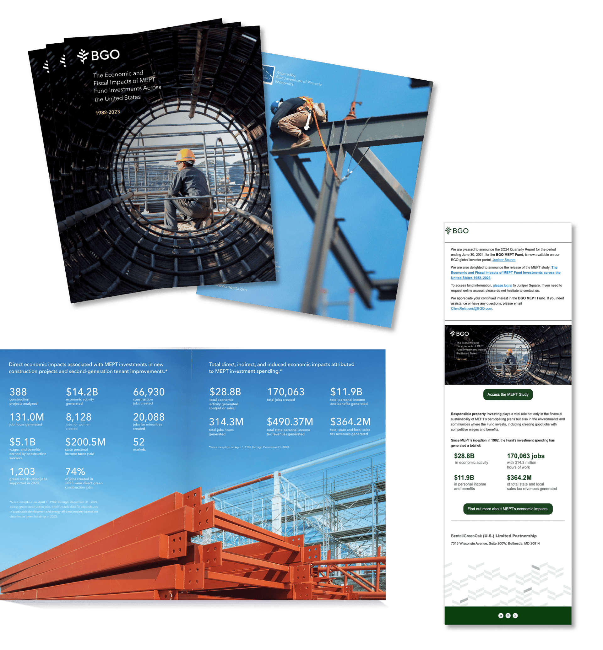
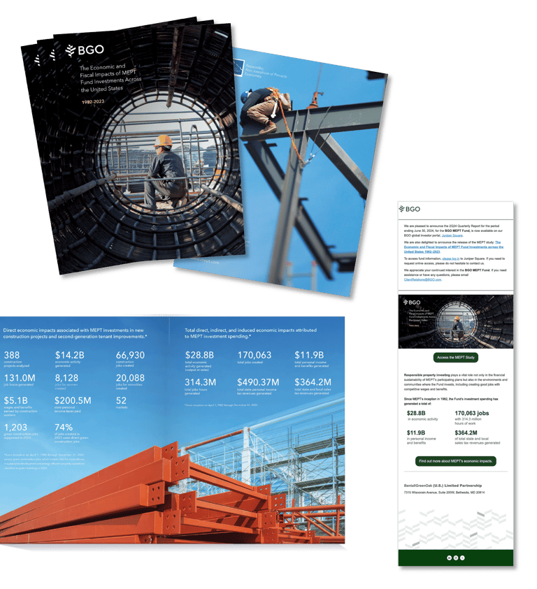
Job Study Report
Selected pages and email to investors
Results
Communication Impact
Significantly improved clarity of complex financial information
Enabled faster comprehension for investor and executive audiences
Strengthened storytelling around performance and strategy
Brand Impact
Established a consistent visual language across investor communications
Elevated perception of professionalism and credibility
Reinforced brand alignment across presentations and reports
Operational Impact
Reduced time spent creating and formatting presentations
Increased efficiency through reusable templates and systems
Improved consistency across teams and communication channels